
Kids Childcare + Preschool
A daycare website that reflects the founder’s vision: lots of colour, a very playful aesthetic and a premium feel.

- Client
- Kids Childcare + Preschool
- Services provided
- Industry
- Small Business
- Integrations
-
- Messenger
- CRM
- Goal
- Canada’s best childcare
Top brand agency. Top architects. Then the website.
Kids Childcare + Preschool came to Neumarkets with a great idea. They wanted to build the best childcare and preschool in Canada.
They hired the top brand agency and architects in Canada and wanted the best web design agency to help create their vision.
They found Neumarkets and had their expectations exceeded.
Daycare
website design.
- Headline
- A new standard of excellence
- Programs
- Infants · Toddlers · Preschoolers
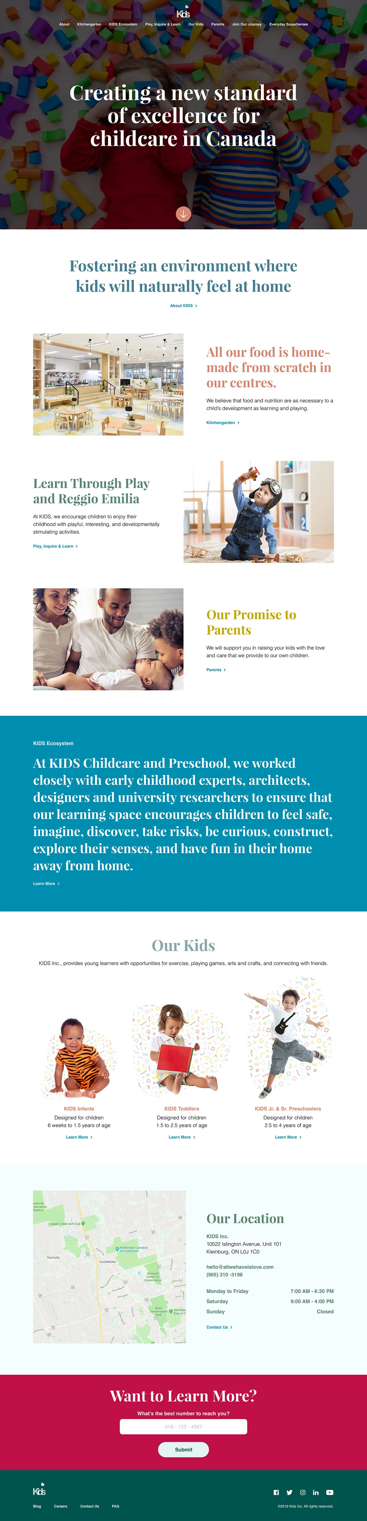
- Video hero: A new standard of excellence
- Photo + story rows: Food · play · parents
- Our Kids: Infants → preschoolers
- Location + hours: Map, contact, opening hours
- Want to learn more?: Form synced to their CRM

Playful, with a premium feel.
Colour, imagery, movement and integrations, and where each one lives on the homepage.
-
Colour
We wanted to use a lot of colour on their website while maintaining a visual balance. The result was a very playful aesthetic with a premium feel. We were able to achieve this using whitespace and a complementary colour palette.
-
Imagery
We used icons throughout the website that perfectly encapsulate the brand and related content. The icons are so fun, and they will stop and make you smile.
We also placed a quirky background behind a lot of images made of basic shapes and squiggles to tie the photos together. The backgrounds are uniquely shaped in each case to add excitement.
-
Movement
When landing on the website, you’re greeted with a video playing in the background while a text overlay tells a story. The video evokes joy, and the text overlay creates an impact setting a tone for the entire website.
The intention was to add subtle animations throughout the website to give the site an additional playful feeling. The subtle movements enhance the brand’s premium spirit.
-
Integrations
We added Messenger to the website, so their team can chat with potential leads. All the contact forms across the site are integrated with their CRM so potential customers can book meetings and tours themselves!
Proud of this one.
They are proud of their website, and so are we!
We designed and developed it. See how we approach both.
More small business
websites.
Four more websites we designed and developed, from yoga studios to award-winning videographers.
-

Yoga Studio Website Design
Kula is a community-based yoga studio, with a variety of class styles and options for students of all ages and walks of life. -

Videographer Website Design
MDS Media was looking for a website that was as attractive as the cinematic trailers they were winning awards for creating. -

Home Decor Website Design
Countrywide Kitchens designs kitchens that look like they’re straight out of a magazine. We had to create a website that was just as beautiful. -

Cleaning Business Web Design
Dhyana is one of Toronto’s most innovative cleaning and sanitization companies, so they needed a web design company to match.


